


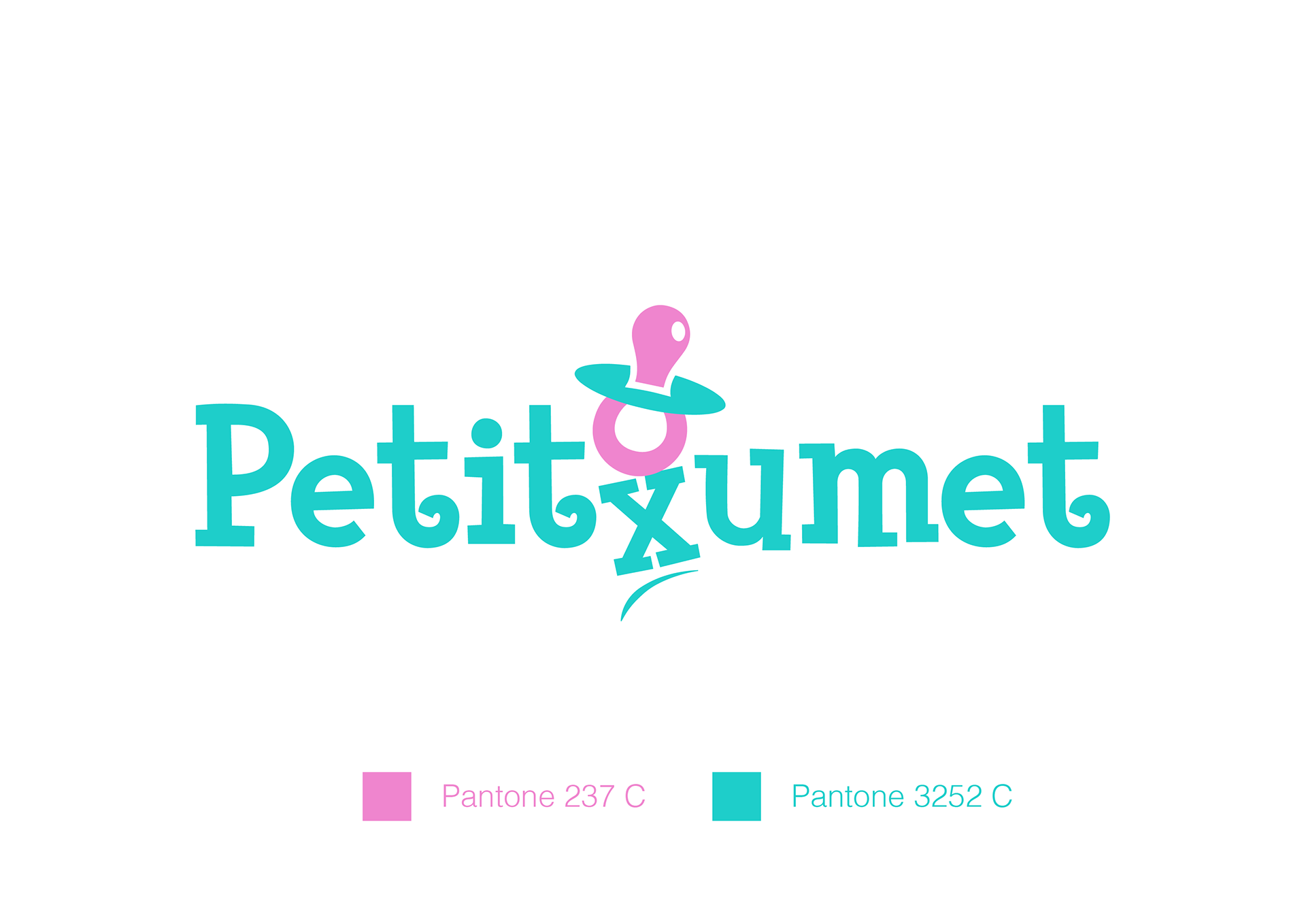
Nuevo diseño de Identidad para PETITXUMET
Para el diseño de la marca se busco un tipografía infantil, pero con un toque moderno.
Para darle ritmo al logo, se utilizó como acento en la división de palabras el icono del chupete, simulando que se está cayendo y mueva la X.
La intención es lograr imponer la palabra completa PETITXUMET y no lo que significa separada PETIT - XUMET (pequeño chupete) en catalán, y de esa forma se interprete como un bloque.
Los colores son colores vivos, uno es verde mediterráneo ya que la marca nace en esta zona y un rosa vibrante.
Se creo el claim "it´s baby time" para acompañar a la marca en algunas aplicaciones.
Luego diseñamos la web para la venta de productos por Amazon. www.petitxumet.com
New Identity design for PETITXUMET
For the design of the brand, a childish typography was sought, but with a modern touch.
To give the logo rhythm, the pacifier icon was used as an accent in the division of words, simulating that it is falling and moving the X.
The intention is to impose the complete word PETITXUMET and not what it means separately PETIT - XUMET (small pacifier) in Catalan, and in this way it is interpreted as a block.
The colors are bright colors, one is Mediterranean green since the brand is born in this area and a vibrant pink.
The claim "it's baby time" was created to accompany the brand in some applications.
Then we design the website for the sale of products by Amazon. www.petitxumet.com
Then we design the website for the sale of products by Amazon. www.petitxumet.com